Our new branding and website
- the story
We spend every working day servicing the needs of our clients and quite often sideline our own marketing and branding projects to prioritise their requirements. Back in April '18 as part of our business development strategy we expanded our skillset and started working with Mark Gorman who came on board as our very own Head of Thinking.
After 11 successful years in business we weren’t unhappy with our distinctive branding or our image but we felt this was a good time to take a second look.
Mark drove this review forward. The first stage was to understand what our clients and staff thought of our business. Thankfully the feedback from Mark’s research was positive and it became clear that our clients see us as a genuine extension of their marketing departments (a cliché we know).
What our clients do is good, but they need communication to amplify the stuff they do to greatness. Our motivation and drive comes from our passionate belief that (small) businesses deserve better. This was reflected in the research and much was made of the detail that goes into everything we create and deliver.
So, it seems we have happy clients and a clear proposition. The next stage was to reflect that across our own branding.
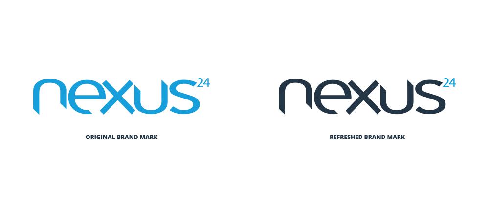
Over its history, Nexus24’s branding has been monochromatic, mainly sticking with the core blue colour and one typeface. It has helped us to stand out from other design agencies and we didn’t want to lose that.
So, sticking to the monochromatic theme, we introduced a very dark (and we mean dark) blue to replace the black and a soft, light, icy blue to replace the white. Nexus black, Nexus white and the core Nexus blue now make up our core colour palette.
The core colours have been supplemented with additional, extremely bright colours to add a bit more personality.
We retained the recognisable nexus24 logo shape. The new colours were applied and the strapline dropped. These tiny changes make so much difference to the feel and tone of the logo.
The devil, as they say, is in the detail.
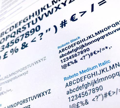
We also refreshed our typestyle, again to reflect our personality and to work better online.
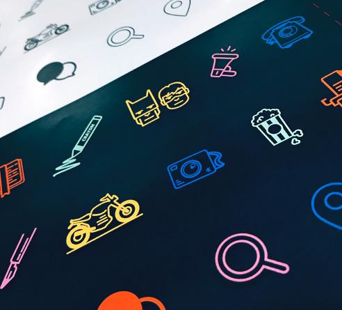
The icons and ‘pop art’ photographic style we chose were brought into line with the new colour palette.
The core message of our ‘mobile first’ website is ‘Making Good Stuff Great’. The navigation is simple and clean without messy drop downs. The nitty-gritty is contained in our case studies found on sub pages for those who want to know more about our detailed design process.
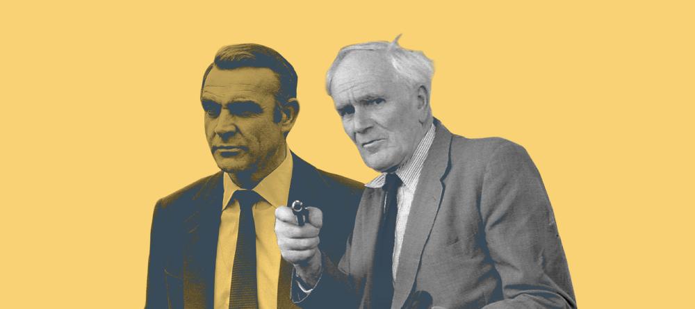
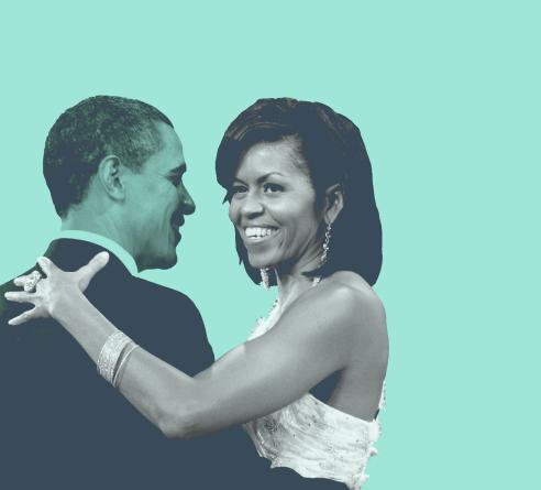
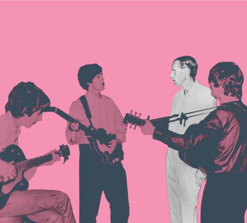
The notion that we are an extension of our clients’ teams and ‘their man in the chair’ was brought to life by presenting famous and great people, but actually making heroes of the people that made them great. Batman is, but he wouldn’t be without his man in the chair, Alfred. Alfred solves Batman’s problems. Michelle was Barack’s rock. Sir George Martin added a further dimension to The Beatles’ songs.
That’s Nexus24. That’s what we do. Behind the scenes we make our clients great.
We’re here to help solve all of their advertising, branding, design and creative needs. And we do it with remarkable delivery.
Our new branding and messaging is now being rolled out and is consistent across everything that bears the nexus24 name.