AN INTOXICATING blend.
Ethimex
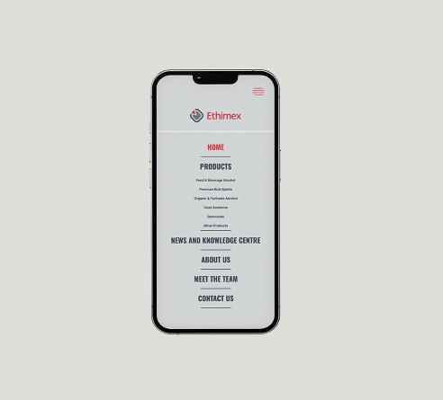
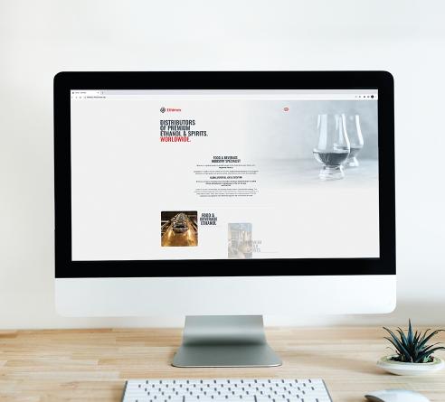
The latest iteration of their website involved pouring the three distinct flavours of their old website into one irresistible concoction to convey one important message: that they are experts in their field. It was also an exercise in modernising the brand and improving the user experience.
It now flows better as you scroll with imagery popping up seamlessly along the way. The overall feel had to be sharper, cleaner and more premium. Think of it as a visual palate-cleanser to hit the reset button for more engagement, with new minimalist fonts to reflect a more organic direction.
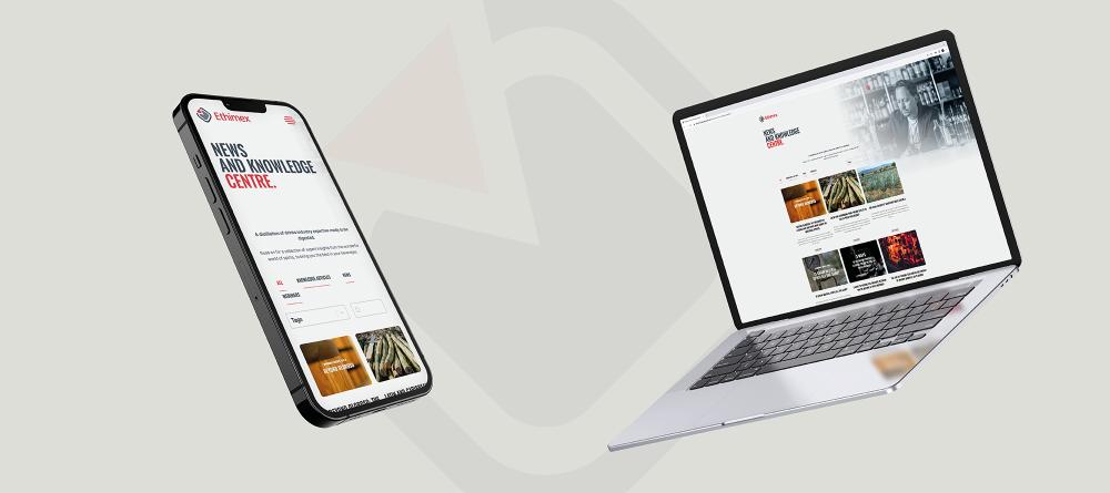
Engagement that comes in the form of an integrated email marketing system to prompt sign-ups for newsletters, webinars and exclusive paywall content, as well as an expanded news and knowledge hub.